BAD INTERFACE
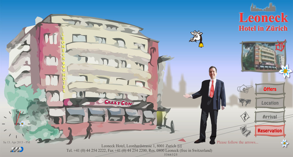
Bad hotel website: The Leoneck Hotel
Simple: 2/5
Clear: 1/5
Consistent: 2/5
Appropriate: 2/5
Appealing: 2/5
Usable: 2/5
The use of colours, images and fonts is inconsistent and not pleasing.
The purpose of each page is not immediately clear.
The navigation bar appears in the main page only and the method of navigation between related pages is not obvious.
The navigation does not allow the user to easily backtrack or return to upper levels in the site.
The interactive virtual tour inside the hotel is confusing and not clear.
Links destination is not always obvious.
Some links are not working.
There is not a contact form.
Map unavailable.
Search function unavailable.
The website is built with Adobe Flash and can not be displayed by iPhone and iPad devices.
The website is not designed to be accessible to disabled users.
Overall I like the attempt to look friendly but I find this website bad and ugly. It looks dated and I do not understand such a large use of vector graphics. When I check out a hotel website I like to see real pictures before booking on-line.
GOOD INTERFACE
Good hotel website: The Hoxton Hotel

Simple: 4/5
Clear: 4/5
Consistent: 4/5
Appropriate: 4/5
Appealing: 5/5
Usable: 4/5
The use of colours, images and fonts (really like the use of Code Pro font family) is consistent and pleasing.
The design is appropriate for the purpose of the site and it will appeal to the target audience.
The page layout is balanced, clean, and uncluttered.
Copyright, privacy, contact and cookie information is easily located.
The purpose of the site (and each page within it) is immediately clear.
The content of the site is logically organized.
The navigation bar is located in the same place on each page of the site and is clearly recognizable.
All links are clearly labelled and their destination obvious.
The use of the browser back button is unnecessary (no dead end pages).
The purpose of each page is easily identified.
Users can get to information with a minimal number of clicks.
The navigation allow the user to easily backtrack or return to upper levels in the site.
There is an obvious method of navigating between related pages on the site.
There is an obvious method of navigating between different sections of the site.
The content reflect the purpose of the site.
The content is appropriate for the intended audience.
The content is sufficient to meet user needs and expectations.
Text content is free from spelling, grammatical, and typographical errors.
Information is correct and current.
Specific content can be easily found.
Search function available.
The site is cross-browser and cross-platform compatible.
All components of the site are functional.
The skills required to use the site’s features are appropriate for its intended audience.
Overall the website looks very good and pro. The fonts chosen, the colour scheme and the quality of pictures are really good. The layout design reflect the architecture of the hotel and also its will to be totally connected and active with the busy and interesting life of the city of London. The only thing missing is a proper quick contact form with the input field. I do thing is a must for all business website.
